Candid
Make informed decisions
Project Overview
Find reliable information to make informed choices.
Simplifying the complexity of political engagement, Candid is an app designed to empower users to stay up to date on upcoming and current politicians.
Uncover detailed candidate histories, explore their positions on crucial issues, and stay connected with real-time news updates - all through an intuitive interface. Candid's innovative touch ensures users receive unparalleled political information at their fingertips.
My Role
UX Designer
UX Researcher
Tools
Figma
Google Meets
Maze
Timeline
October 2023 - November 2023
Simplifying the complexity of political engagement, Candid is an app designed to empower users to stay up to date on upcoming and current politicians.
Uncover detailed candidate histories, explore their positions on crucial issues, and stay connected with real-time news updates - all through an intuitive interface. Candid's innovative touch ensures users receive unparalleled political information at their fingertips.
Background
What's your Problem?
With the political realm becoming increasingly intricate, how can individuals efficiently explore and understand the backgrounds and stances of various candidates? Candid steps in to simplify political exploration. By tackling the complexity associated with candidate histories and issue positions, this app provides a clear and accessible avenue for users to engage with the political process.
Project Goals
Ultimately, the overarching goal of Candid is to encourage informed civic participation.
By making political information accessible, understandable, and engaging, the project envisions a future where citizens are actively involved in the democratic process, armed with the knowledge they need to make impactful decisions.
Discover
Competitive Analysis
I began to evaluate what current political platforms included to find the gaps in information. The most popular used sites such as Ballotpedia or Activote evaluate candidate statements and current issues moving through congress, but do not allow users to get a comprehensive view of each individual candidate to inform voting decisions. That research is left to the user as they sift through candidate sites and news articles to find the facts.
User Research
Hearing from users what they prioritize when researching candidates and current politicians was a vital part of the development of Candid. This ensured that I had an understanding of what information users rely on and how they go about learning it.
Define
User Personas
After discussing political habits and desires, I was able to curate personas according to my users needs. Since my research had a bias of people choosing to volunteer as an interviewee because they are already interested in politics, I also created a persona based on those who do not already actively participate.
User Research
Hearing from users what they prioritize when researching candidates and current politicians was a vital part of the development of Candid. This ensured that I had an understanding of what information users rely on and how they go about learning it.
All users wanted to know a candidate’s stance on current issues.
Users desired the ability to quickly access a candidate’s history
Users wanted objective information about the candidate
Users spent between 30 minutes to one hour a day reading news
All users wanted to know a candidate’s stance on current issues.
Users desired the ability to quickly access a candidate’s history
Users wanted objective information about the candidate
Users spent between 30 minutes to one hour a day reading news
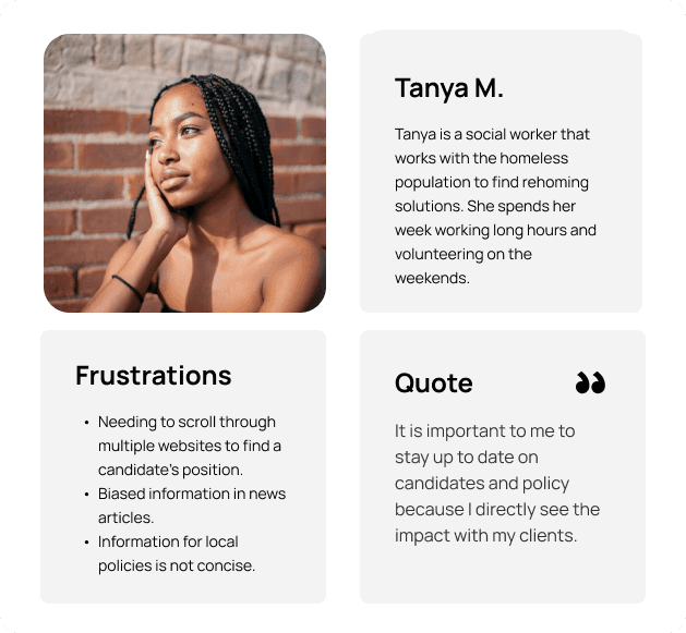
Tanya M.
Tanya is a social worker that works with the homeless population to find rehoming solutions. She spends her week working long hours and volunteering on the weekends.
Quote
“It is important to me to stay up to date on candidates and policy because I directly see the impact with my clients.”
Frustrations
Needing to scroll through multiple websites to find a candidate’s position.
Biased information in news articles.
Information for local policies is not concise.
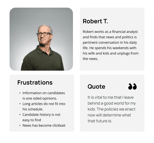
Robert T.
Robert works as a financial analyst and finds that news and politics is pertinent conversation in his daily life. He spends his weekends with his wife and kids and unplugs from the news.
Quote
“It is vital to me that I leave behind a good world for my kids. The policies we enact now will determine what that future is.”
Frustrations
Information on candidates is one sided opinions.
Long articles do not fit into his schedule.
Candidate history is not easy to find
News is clickbait drama.
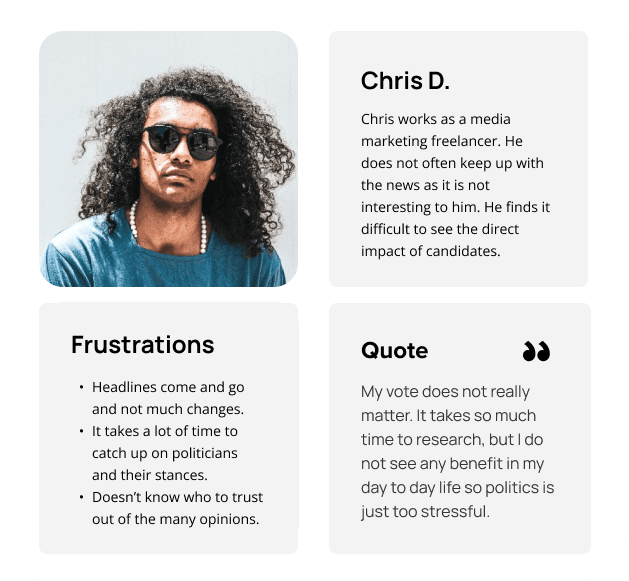
Chris D.
Chris works as a media marketing freelancer. He does not often keep up with the news as it is not interesting to him. He finds it difficult to see the direct impact of candidates.
Quote
“My vote does not really matter. It takes so much time to research, but I do not see any benefit in my day to day life.”
Frustrations
Headlines come and go and not much changes.
It takes a lot of time to catch up on politicians and their stances.
Doesn’t know who to trust out of the many opinions.
Exploring Insights
Separating the insights by topic, I reviewed what desires and struggles my users had experienced. This way I was able to separate what topics came up the most often and apply my profile information accordingly.
Explore Further

Explore Further
Develop
Sketching Ideas
I created low fidelity sketches to display what a candidate account could include. This allowed me to explore the presentation of issues and voting history in a way that would be quickly understandable by scrolling users.


Develop
Sketching Ideas
I created low fidelity sketches to display what a candidate account could include. This allowed me to explore the presentation of issues and voting history in a way that would be quickly understandable by scrolling users.
Defining
Candid contains a myriad of information and defining how to present the key points is vital to a user's ability to quickly understand what's on the page.
Colors
Solidifying a consistent color scheme for users to easily recognize native app elements versus colors used to portray information such as party affiliation. In order to keep the screens from becoming confusing, a simple black and white color scheme was used on functions and features of the app, while colors for parties will stand in vibrant contrast.
Account
Creating an account page for politicians needed to feel official, yet familiar, and allow a user to access the main information to explore a candidate. After some iteration, I decided to include a banner image, enabling the page to contain imagery from a politician's website to individualize each page.

Candidate Name
Position
Party Affiliation
Linktowebsite.com
linktoinstagram
LinktoX/twitter
Follow

Candidate Name
Position
Party Affiliation
News
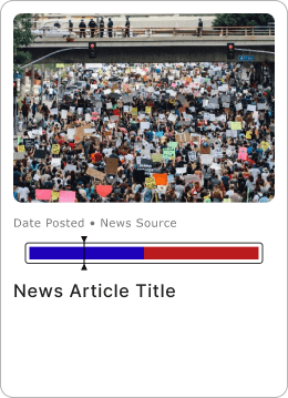
Having access to news articles that allow a user to quickly see the source and possible bias allows for fully informed research to be done. Presenting this articles in a clear way required a larger card and presenting the bias of the article at the forefront without disrupting the mental model a user has for a news article. Having a scale at the forefront gives the user the ability to quickly understand the bias in the article.

Article Title
News Article Title

Before
After
Before
After
Filter
Initially, the design for filters in the app was a multilayered system that allowed a user to select as they browse to alter the results. In order to give users a model that would be more familiar, I experimented with using a filter pop up instead. This allowed for more options to be included using information architecture to separate different types of filter options.
Filters
Show Results
Party
Republican
Democratic
Libertarian
Independent
Green Party
Branch
Executive
Legislative
Judicial
Education
Treasury
Administration
Position Status
Incumbent
Candidate
Clear Selection
Filters
Show Results
Party
Republican
Democratic
Libertarian
Independent
Green Party
Branch
Executive
Legislative
Judicial
Education
Treasury
Administration
Position Status
Incumbent
Candidate
Clear Selection
Democratic: Blue (#1F01B9)
Republican: Red (#BA1B1D)
Independent: Purple (#9747FF)
Green Party: Green (34A853)
Libertarian: Gold (#FBBC05)
Nonpartisan: Black Outline (#333333)
Democratic: Blue (#1F01B9)
Republican: Red (#BA1B1D)
Independent: Purple (#9747FF)
Green Party: Green (34A853)
Libertarian: Gold (#FBBC05)
Nonpartisan: Black Outline (#333333)
Filter
Initially, the design for filters in the app was a multilayered system that allowed a user to select as they browse to alter the results. In order to give users a model that would be more familiar, I experimented with using a filter pop up instead. This allowed for more options to be included using information architecture to separate different types of filter options.
Define
User Personas
After discussing political habits and desires, I was able to curate personas according to my users needs. Since my research had a bias of people choosing to volunteer as an interviewee because they are already interested in politics, I also created a persona based on those who do not already actively participate.
Deliver
High Fidelity
Building the app from the components up, Candid is a clean application that allows for easy browsing and ease of access to information regarding candidates and politicians.
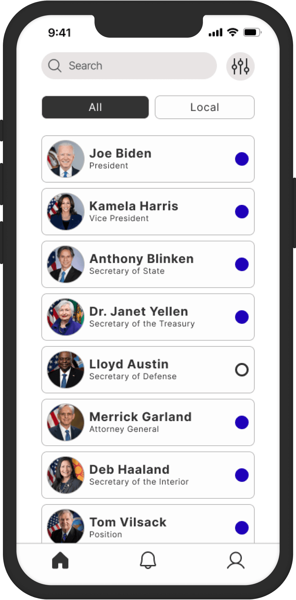


Account
Creating an account page for politicians needed to feel official, yet familiar, and allow a user to access the main information to explore a candidate. After some iteration, I decided to include a banner image, enabling the page to contain imagery from a politician's website to individualize each page.
News
Having access to news articles that allow a user to quickly see the source and possible bias allows for fully informed research to be done. Presenting this articles in a clear way required a larger card and presenting the bias of the article at the forefront without disrupting the mental model a user has for a news article.
Deliver
High Fidelity
Building the app from the components up, Candid is a clean application that allows for easy browsing and ease of access to information regarding candidates and politicians.
Usability Testing
Five participants were recruited to complete tasks moderated and twelve participants completing tasks unmoderated. This was done separately as to analyze each environment distinctly.
User Feedback
Users reported that they would use search primarily and that they struggled to locate the apply filters button, making the task difficult to complete. This meant taking a look at other ways to present the filter application in a way that users can easily locate.
Search Versus Filter
Users primarily got confused when given facts about the candidate they were meant to find. Users immediately move to the search bar in order to find the candidate by name rather than by their information. In this study, the search function was not enabled in order to test out the usability of the filter function.
Left Image: Moderated testers attempted to use the search function to complete the task.
Right Image: Unmoderated testers would test out the available accounts and the search function immediately.


Applying Filters
Once they had accessed the filters, users struggled to identify exiting the filters and applying them. 2 of 5 moderated users scrolled to the bottom to look for the apply filters option rather than the top and 2 of 5 moderated testers swiped the filters down, explaining they thought that filters would automatically apply.
Left Image: Moderated testers did succeed in finding the apply filter option after trial and error.
Right Image: Unmoderated testers overwhelmingly found the apply filters option, but also attempted to exit to apply.
“I expected the filters to automatically apply. Or I expected it to be at the bottom.”
“The filter options were clear and I liked that I can use them to refine my search efficiently.”
“My first instinct is to search their name, I am unsure how else to find the candidate.”
Apply filters worked well because I look at my screen top to bottom. Primarily I would use search"
Exploring Insights
Separating the insights by topic, I reviewed what desires and struggles my users had experienced. This way I was able to separate what topics came up the most often and apply my profile information accordingly.
Tasks Assigned
Flow 1: Find Local politician’s information: find candidate history
Flow 2: Check their position on current issues
Flow 3: Find information about a presidential candidate and listen to news article
Flow 4: Check activity
Flow 5: Unfollow Issue
Applying Filters
Once they had accessed the filters, users struggled to identify exiting the filters and applying them. 2 of 5 moderated users scrolled to the bottom to look for the apply filters option rather than the top and 2 of 5 moderated testers swiped the filters down, explaining they thought that filters would automatically apply.
First Image: Moderated testers did succeed in finding the apply filter option after trial and error.
Second Image: Unmoderated testers overwhelmingly found the apply filters option, but also attempted to exit to apply.
Search Versus Filter
Users primarily got confused when given facts about the candidate they were meant to find. Users immediately move to the search bar in order to find the candidate by name rather than by their information. In this study, the search function was not enabled in order to test out the usability of the filter function.
First Image: Moderated testers attempted to use the search function to complete the task.
Second Image: Unmoderated testers would test out the available accounts and the search function immediately.
User Feedback
Users reported that they would use search primarily and that they struggled to locate the apply filters button, making the task difficult to complete. This meant taking a look at other ways to present the filter application in a way that users can easily locate.
Iterations
Apply Filters
In order to diminish confusion surrounding the filter application, I reconfigured how to present the apply filters and clear selection options so that users would quickly understand their options.
Filters
Party
Republican
Democratic
Libertarian
Independent
Green Party
Branch
Executive
Legislative
Judicial
Education
Treasury
Administration
Position Status
Incumbent
Candidate
State
Alabama
Alaska
Arizona
Arkansas
California
Colorado
Connecticut
Delaware
Florida
Georgia
Hawaii
Idaho
Illinois
Indiana
Iowa
Kansas
Kentucky
Louisiana
Maine
Maryland
Massachusetts's
Michigan
Minnesota
Mississippi
Missouri
Montana
Nebraska
Nevada
New Hampshire
New Jersey
New Mexico
New York
North Carolina
North Dakota
Ohio
Oklahoma
Oregon
Pennsylvania
Rhode Island
South Carolina
South Dakota
Tennessee
Texas
Utah
Vermont
Virginia
Washington
West Virginia
Wisconsin
Wyoming
Clear Selection
Clear Selection
Show Results
Iterations
Apply Filters
In order to diminish confusion surrounding the filter application, I reconfigured how to present the apply filters and clear selection options so that users would quickly understand their options.
Filters
Party
Republican
Democratic
Libertarian
Independent
Green Party
Branch
Executive
Legislative
Judicial
Education
Treasury
Administration
Position Status
Incumbent
Candidate
Clear Selection
Show Results
Work With Me
Conclusion
Information Importance
A vital part of this application involved prioritizing the availability of information. This allowed me to expand on informational architecture and tastefully mixing in imagery and icons in order to adequately educate at a glance. This also allows a user more time to browse rather than spend time decoding the application.
Awareness
As the political field becomes more scrutinized and more people participate, it is important to be aware of how any design decisions may be considered bias or pushing a specific agenda. In creating an application that is simply the landing page for political information rather than a vehicle of debate, keeping a simple color scheme and clear functions was vital.
Understanding Users
In my user interviews, I needed to ensure that my questions were created to allow them to answer without any push or bias being infused. Their frustrations and desires was the goal information and in order to tap into that. Users wanted unbiased information, but they also wanted to be able to identify quickly whether a candidate aligned with them. This showed me that having quick visuals that were accompanied with more in depth information being practical to meet research criteria.
Users also expressed that while federal information was easier to find, local information was much more sparse. Less sources covering the topics and the bias of the party that heavily impacts local news stations were main issues, not necessarily that people were less interested in researching their area. Having relevant news for each candidate rather than an overall news page allowed for information to be more concentrated to each politician, allowing a user to more quickly find the information they wanted about local candidates. By focusing on how the app would function with a users needs, I created a platform that will be a return tool.
Work with me
Conclusion
Information Importance
A vital part of this application involved prioritizing the availability of information. This allowed me to expand on informational architecture and tastefully mixing in imagery and icons in order to adequately educate at a glance. This also allows a user more time to browse rather than spend time decoding the application.
Awareness
As the political field becomes more scrutinized and more people participate, it is important to be aware of how any design decisions may be considered bias or pushing a specific agenda. In creating an application that is simply the landing page for political information rather than a vehicle of debate, keeping a simple color scheme and clear functions was vital.
Understanding Users
In my user interviews, I needed to ensure that my questions were created to allow them to answer without any push or bias being infused. Their frustrations and desires was the goal information and in order to tap into that. Users wanted unbiased information, but they also wanted to be able to identify quickly whether a candidate aligned with them. This showed me that having quick visuals that were accompanied with more in depth information being practical to meet research criteria.
Users also expressed that while federal information was easier to find, local information was much more sparse. Less sources covering the topics and the bias of the party that heavily impacts local news stations were main issues, not necessarily that people were less interested in researching their area. Having relevant news for each candidate rather than an overall news page allowed for information to be more concentrated to each politician, allowing a user to more quickly find the information they wanted about local candidates. By focusing on how the app would function with a users needs, I created a platform that will be a return tool.
"Apply filters worked well because I look at my screen top to bottom. Primarily I would use search"
“My first instinct is to search their name, I am unsure how else to find the candidate.”
“The filter options were clear and I liked that I can use them to refine my search efficiently.”
“I expected the filters to automatically apply. Or I expected it to be at the bottom.”
Before
Candidate Name
Position
Party Affiliation
Linktowebsite.com
linktoinstagram
LinktoX/twitter
Follow
After
Candidate Name
Position
Party Affiliation
Upcoming
Democratic
Republican
Libertarian
Local
Federal
Congress
Representatives
Justices
Candidates
Article Title
News Article Title
Before
After
Before
Upcoming
Democratic
Republican
Libertarian
Local
Federal
Congress
Representatives
Justices
Candidates
After

Before
After