Provide a variety of moving service options for bookings.
I then laid out all the steps necessary to complete key tasks inside Aida to ensure that each detail was thought out for a seamless user experience.
Ideation
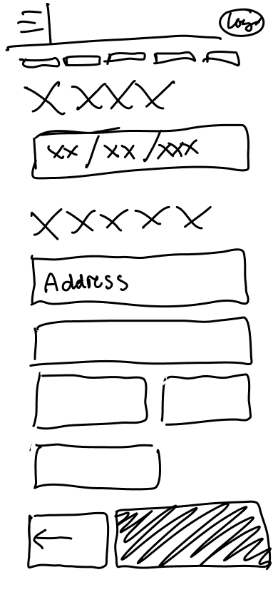
With my main flows laid out, I moved into lo fidelity wireframing to begin to pull all the pieces together. With hindsight being 20-20, next time I would ensure that even my low fidelity wireframes are more thorough in exploring the process as these sketches only hit on key points during the flow.
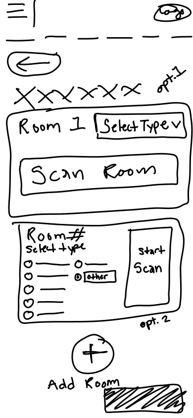
Moving into mid fidelity, my focus was to further flesh out the elements that would lead a user to success. Items such as how to present the ability to scan multiple rooms and what key components to include for the businesses recommended to allow the user to quickly see all the key information that they'd need.
Mid Fidelity
Branding
Once I had laid out key elements, I was ready to begin creating branding elements to putt the idea together. I started by creating brand values and creating a color palette that would reflect them.
Credible: I chose credible in because I wanted site to enable the user to instantly feel comfortable using the product and feel comfortable inputting their personal information. In this age of the internet, there are scams on every corner and it is important that a user can instantly be put at ease when entering the site.
Efficient: Due to the main complaint of my users being time management, I chose efficiency as a value in order to address this and present the product as a way to save the time that is so precious to them.
Personal: Every users' situation will be different and I want each one to feel that Aida is curating specifically for them, therefore I chose this value to cater to that need.
Trust: Along with credibility, trust is a suitable value as the user needs to trust that the service will successfully recommend the best options for them in order to commit to using the product.
Satisfaction: This is a key value as a user's satisfaction is what will lead them to recommend it to friends and return to use the service again. It is important that every interaction of the process allows the user to feel in control and satisfied.
Blue: I chose this shade of blue as the color reflects credibility and trust for my users as well as a sense of calm to put the user at ease in a stressful time of moving.
Coral: I chose coral as it radiates positivity and brings out the value of satisfaction.
Creating a logo from these meant looking deeper into what would quickly and simply reflect these values of credibility, efficiency, being personal, trustworthy, and bringing satisfaction. I began this process with a few different ideas for simplicity.
I preferred the second but was reminded of a scene from the Disney Movie "The Incredibles" where Syndrome uses a tracking tool called an Omnidroid Tracker used to scan an underwater cave and attempt to find Mr. Incredible. The manner that this Tracker scanned the space was a great visualization for how the service would scan a space in order to analyze a user's belongings. This inspired the final version of the logo for Aida.
I chose this iteration due to the recognizable shape that is evocative of the first letter of the service: Aida.
When creating the name for the brand, the goal was to have a simple and memorable name that was in touch with some of the key values of efficiency and satisfaction. The name needed to be somewhat abstract in order to fit into the modern atmosphere of online branding. Since the platform was integrating AI technology, I found it important that the brand name also sound like it could be the name of a character or integrated into the AI portion of the service. Aida was the perfect fit as it was short, punchy, abstract as to not be competing with user's favorite services, and perfect to name the AI character that would be assisting users in completing their moving plan.


Ideation
Overview
Background
Details
As a student in DesignLab's UX Academy, I was tasked with solving a problem users experience with moving their residence.
Project Type
Mobile Website
Tools Used
Figma
Figjam
Vowel
Optimal Sort
Social Media (for recruiting)
My Role: UX/UI Designer, UX Researcher. Student
March 2023 - June 2023
Table of Contents
Problemtt
Pulse Check
I allowed users on Instagram to tell me their biggest moving pain points.
In order to get personal insights from individuals who had moved, I used my same instagram social media to allow those who were willing to participate in a remote conversation.
Qualifications to participate
Participant must have moved their residence in the last five years.
Execution
Research discussions took place remotely using Vowel video calling.

Discover
In order to better understand what was already being offered, I began the process of research by finding main competitors in the moving space when it came to packing and moving belongings.
Competitive Analysis
Participants
Affinity Mapping
Company
Area of Expertise
Strengths
Weaknesses
Lugg
Booking a moving
service
Allows users to book
a move as little as 30
minutes before.
Can facilitate item
pickups as well as
home moves.
Not widely available
Only has full service
moves or item pickup
options.
Reviews report false
pricing and dissatisfaction
with the staff and wait
times.
Sortly
A platform for users
to input all of their
belongings and print
QR codes to label
each box.
Allows a user to get
inventory of their
home.
Assists in unpacking
organization.
$500 yearly membership.
Time consuming to set
up.
Can only load 50 boxes.
Dolly
Booking service for
small moves and item
pickup or labor.
Versatile options for
labor and moving.
Only assists with small
moves.
Reviews state that there
was no insurance
protection for damaged
goods.
Uhaul
A truck rental service
that allows users to rent
a truck for their move.
Versatile truck options
nationwide.
Allows users to book
both labor and truck
rentals.
Has storage options.
Broad guidelines for users
to recommend which size
is best for them.
Using insights from user interviews, I organized user feedback into the main categories that stood out: time management, planning, cost, and user desires for moving services.

Affinity Mapping from Figjam
Insights
5/5 Users stated an issue with time management.
5/5 Users considered efficiency more important than cost.
4/5 Users spent one month or more planning move logistics.
3/5 Users desired insurance/price clarity between companies.
*Due to time and project constraints with an MVP product, concerns such as customer service would need to be addressed later on if the product was to be developed.
We want to learn what part of the moving process is difficult for users in order to
understand what features may ease these pain points.
User Research
Define
Personas
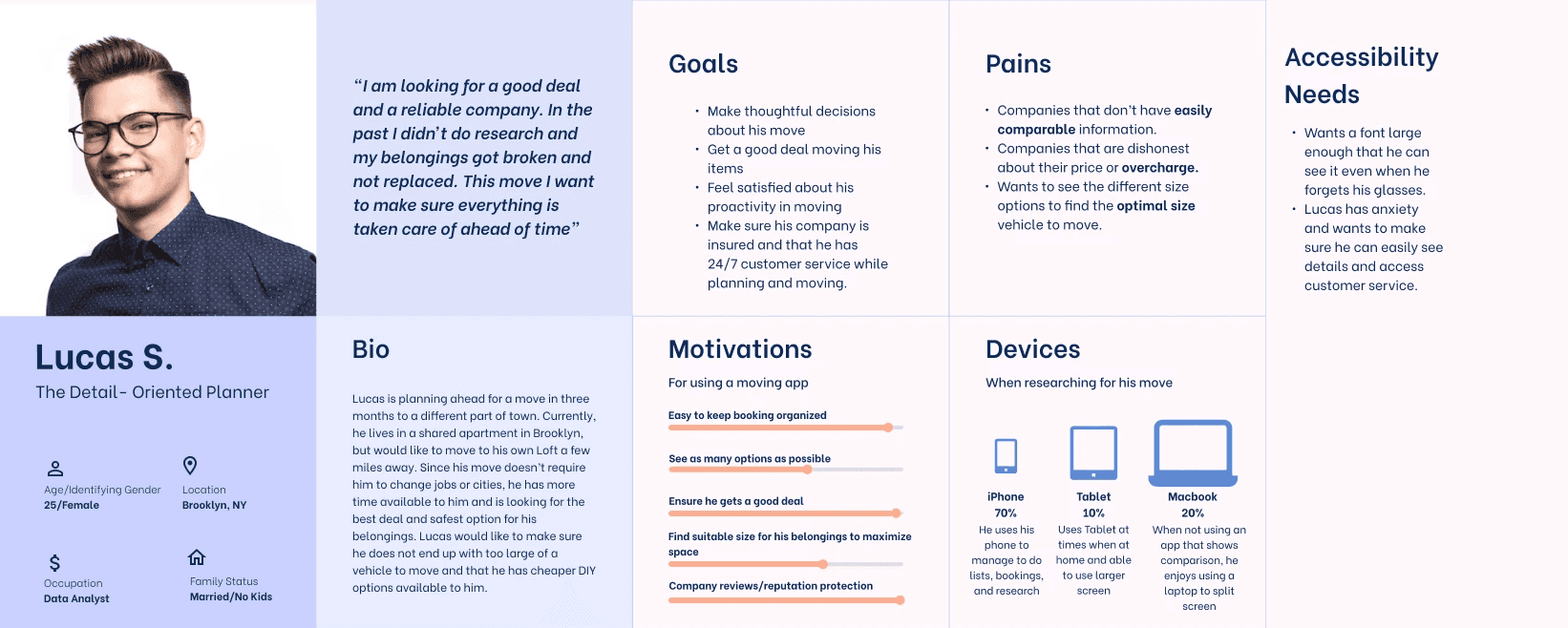
Using my insights from user interviews, I created three distinct personas to embody my users' needs.
Features
Task Flows
Using my personas and user interviews, I created a list of features that could be included to address their needs.
Account Creation and Account Page
Users can compare different services that fit their needs.
Using plan data, users receive a curated selection of companies.
Ability to book services through the site using recommendations.
Provide a variety of moving service options for bookings.
AI dimensional scanning tool to curate recommendations.
I then laid out all the steps necessary to complete key tasks inside Aida to ensure that each detail was thought out for a seamless user experience.
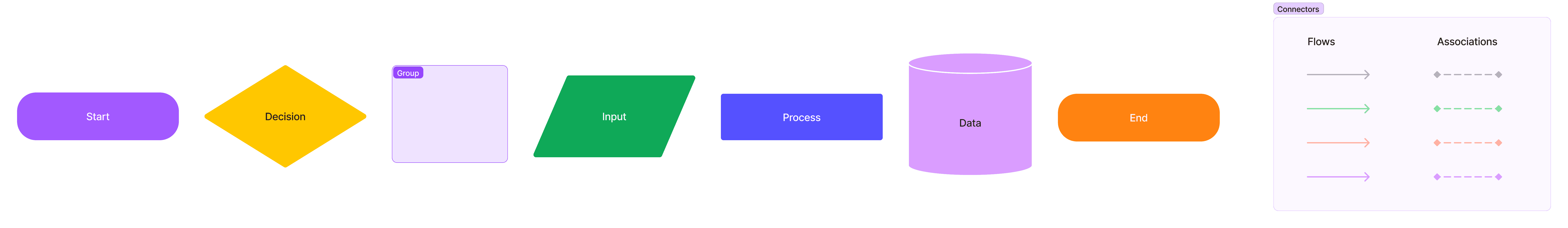
Legend
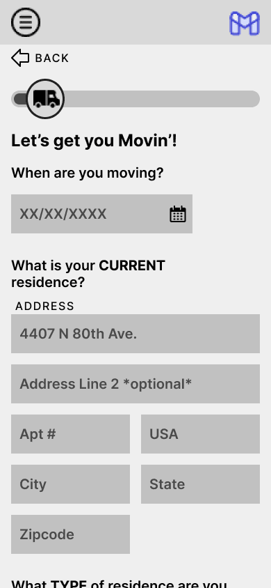
Creating a Moving Plan

This flow walks a user through entering key information used to make a recommendation for the size of vehicle,
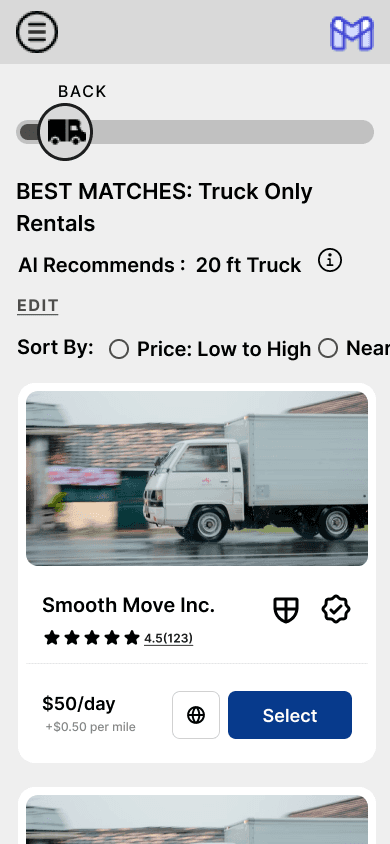
amount of laborers or amount of time needed for their service. The user can then view comparisons of the different
companies that can meet their needs once they go to make a booking.
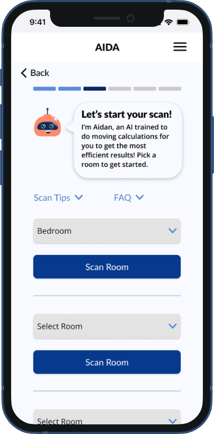
Conducting an AI Scan

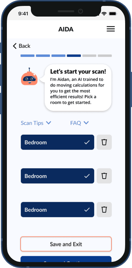
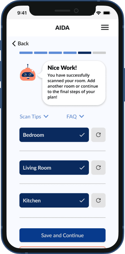
This flow walks through how the user would conduct a scan of a room in order for the application to analyze the amount and size of belongings that a user is moving.
User Flows
Creating a Plan


This flow shows the steps a user would take in creating a moving plan along with potential errors that may occur and what portion of the process that error would redirect them to. Creating this flow allowed me to think about the different touchpoints of the flow that would need to be provided to be successful and correct potential errors.
Problem
People struggle to move their residence and dislike the process involved.
Solution
Integrate AI to relieve burden of research and finding the best solution from users.
Conclusion
What I learned
Flexibility
Creating Aida allowed me to explore the different parts of the UX process and practice creating within loose guidelines before moving into more strict projects. This was exciting! Along the way I learned more about myself as a designer and how I want to move forward in future projects.
When it came to meeting time constraints and working with others' time for user interviews and testing, I learned that things not going as planned is part of the design process. In times where an icon I had made wasn't working with the flow and I'd need to stop progress to find the best way to present an idea, flexibility became a catalyst for creating a more usable and pleasing interface. This typically resulted in creating something that I was more proud of and that elevated the entire page it was on.
Be Open
Using time with my peers to get feedback on iterations that were incomplete or flows that were still in the works allowed me to become more comfortable showing unperfect work. This feedback often allowed me to fix issues before it would have been more difficult. Being open also included explaining my design decisions and thought process, and sharing made it easier for feedback to be pertinent.
Ask Away
Looking back, I learned that I could have asked more questions during my interviews in order to have more specific insights. Since interviews occurred early on in the process, I didn't have the idea fully fleshed out to ask the questions I wanted answers to later on. In the future I would ask more questions with more specific scenarios involved to get more in depth insights.
Simple
Simplicity was complicated, which is ironic! Keeping elements simple yet understandable was a barrier for me as shown in my iterations. I learned that I need not be afraid of adding multiple elements to give the user context, the key is to keep those additional elements simple, not to take away all detail to create the simplicity.
Work with Me
Simple
Solution
Integrate AI to relieve burden of research and finding the best solution from users.
Problem
People struggle to move their residence and dislike the process involved.
My Role: UX/UI Designer,
UX Researcher. Student
March 2023 - June 2023
Table of Contents
Overview
Background
As a student in DesignLab's UX Academy, I was tasked with solving a problem users experience with moving their residence.
Details
Project Type
Mobile Website
Tools Used
Figma
Figjam
Vowel
Optimal Sort
Social Media (for recruiting)
Pulse Check
I allowed users on Instagram to tell me their biggest moving pain points.
In order to better understand what was already being offered, I began the process of research by finding main competitors in the moving space when it came to packing and moving belongings.
Lugg
Area of Expertise
Strengths
Weaknesses
Booking a Moving Service
Allow Users to book a move as little as 30 minutes before.
Can facilitate item pickups as well as home moves.
Not widely available.
Only provides full service moves or item pickup options.
Reviews report false pricing and dissatisfaction with staff and wait times.
Sortly
Area of Expertise
Strengths
Weaknesses
Allows a user to get a full inventory of their home.
Assists in unpacking organization.
$500 yearly membership.
Time consuming to set up.
Can only load 50 boxes.
A platform for users to input all of their belongings and print QR codes that label each box.
Dolly
Area of Expertise
Strengths
Weaknesses
Versatile Options for labor and moving.
Only assists with small moves.
Reviews state that there was no insurance protection for damaged goods.
Booking service for small moves, item pickup or labor.
UHaul
Area of Expertise
Strengths
Weaknesses
Broad guidelines for users to recommend which size is best for them.
A truck rental service that allows users to rent a truck for their move.
Versatile Truck options.
Allows users to book labor and truck rentals.
Has storage options.
User Research
We want to learn what part of the moving process is difficult for users in order to understand what features may ease these pain points.
Participants
In order to get personal insights from individuals who had moved, I used my same instagram social media to allow those who were willing to participate in a remote conversation.
Using insights from user interviews, I organized user feedback into the main categories that stood out: time management, planning, cost, and user desires for moving services.
5/5 Users stated an issue with time management.
5/5 Users considered efficiency more important than cost.
4/5 Users spent one month month or more planning move logistics.
3/5 Users desired insurance/price clarity between companies.
*Due to time and project constraints with an MVP product, concerns such as customer service would need to be addressed later on if the product was to be developed.
Qualifications to participate
Participants must have moved their residence in the last five years.
Affinity Mapping
Insights
Execution
Research discussions took place remotely using Vowel video calling.
Discover
Competitive Analysis
Define
Personas
Using my insights from user interviews, I created three distinct personas to embody my users' needs.
Features
Using my personas and user interviews, I created a list of features that could be included to address their needs.
Account Creation and Account Page
AI dimensional scanning tool to curate recommendations.
Using plan data, users receive a curated selection of companies.
Users can compare different services that fit their needs.
Ability to book services through the site using recommendations.
Task Flows
Legend
Creating a Moving Plan
This flow walks a user through entering key information used to make a recommendation for the size of vehicle, amount of laborers or amount of time needed for their service. The user can then view comparisons of the different companies that can meet their needs once they go to make a booking.
Conducting an AI Scan
This flow walks through how the user would conduct a scan of a room in order for the application to analyze the amount and size of belongings that a user is moving.
User Flows
Creating a Plan
This flow shows the steps a user would take in creating a moving plan along with potential errors that may occur and what portion of the process that error would redirect them to. Creating this flow allowed me to think about the different touchpoints of the flow that would need to be provided to be successful and correct potential errors.

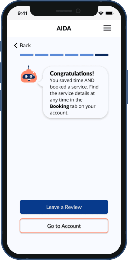
This flow displays the vital steps of a user setting up a booking using their curated recommendations. Later on, I added an option for a truck with a driver as an additional service option as well.
With my main flows laid out, I moved into lo fidelity wireframing to begin to pull all the pieces together. With hindsight being 20-20, next time I would ensure that even my low fidelity wireframes are more thorough in exploring the process as these sketches only hit on key points during the flow.
When creating the name for the brand, the goal was to have a simple and memorable name that was in touch with some of the key values of efficiency and satisfaction. The name needed to be somewhat abstract in order to fit into the modern atmosphere of online branding. Since the platform was integrating AI technology, I found it important that the brand name also sound like it could be the name of a character or integrated into the AI portion of the service. Aida was the perfect fit as it was short, punchy, abstract as to not be competing with user's favorite services, and perfect to name the AI character that would be assisting users in completing their moving plan.
Develop
After deciding on branding, I moved into creating a component library to utilize for my hi-fidelity prototype for user testing. In this library, I created each main element and card. Icons for the services were also created by myself and accompanied by Google's Material Design Icon Library in order to blend well with a user's experience browsing the web. The keyboard used for the prototype was also outsourced as an Apple keyboard to create a realistic experience during user testing.

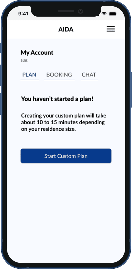
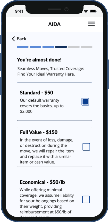
Hi-Fidelity Prototype
Creating the hi-fidelity prototype was a process of creation and iteration. Take a look below to see the journey that a user would be sent on in order to create their plan and book a service.


Usability Testing
Flows Used for Testing
Participants went through creating an account, beginning and creating a moving plan, conducting AI scans, and booking a service.
Execution
Usability Testing took place in Maze and was proctored using Google Meets and Tictaq transcript plugin.

Usability Feedback Results
The main issue that arose during testing was users being unsure of how to move forward on the room detail page. Users would hesitate after confirming a room and were not automatically drawn to the dropdown to select the next room. One interviewee stated that it seemed unreasonable to need to go back through the rooms to check details if the user had previously left the room before to scan the next.
The second most common issue within the usability testing was the "Scans Completed" screen that allowed users to delete a room which would prompt them to rescan. Users felt it was unclear that they would be able to rescan the room if they deleted it.
Solutions
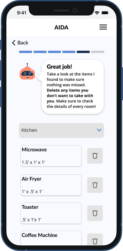
In order to ensure that a user was able to understand that they were able to edit the details of the room and would need to verify them before moving on. I moved the "Room Details" page to directly after a scan and allowed users to add an item or delete scanned items if they were incorrect or if they were not going to be moving with them. Future iterations of the product would allow users to include "Clutter Scans" which would enable them to scan the insides of drawers or cabinets to include those belongings in the scan process.
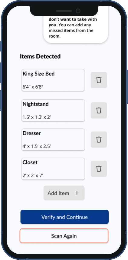
The alteration of the "Scan Completed" page mainly consisted of changing the icon used for the button. To clarify that a user was able to disregard a past scan and rescan a room anew, I used a spinning arrow in place of the trash icon.
Conclusion
Creating Aida allowed me to explore the different parts of the UX process and practice creating within loose guidelines before moving into more strict projects. This was exciting! Along the way I learned more about myself as a designer and how I want to move forward in future projects.
What I Learned
Flexibility
When it came to meeting time constraints and working with others' time for user interviews and testing, I learned that things not going as planned is part of the design process. In times where an icon I had made wasn't working with the flow and I'd need to stop progress to find the best way to present an idea, flexibility became a catalyst for creating a more usable and pleasing interface. This typically resulted in creating something that I was more proud of and that elevated the entire page it was on.
Be Open
Using time with my peers to get feedback on iterations that were incomplete or flows that were still in the works allowed me to become more comfortable showing unperfect work. This feedback often allowed me to fix issues before it would have been more difficult. Being open also included explaining my design decisions and thought process, and sharing made it easier for feedback to be pertinent.
Ask Away
Looking back, I learned that I could have asked more questions during my interviews in order to have more specific insights. Since interviews occurred early on in the process, I didn't have the idea fully fleshed out to ask the questions I wanted answers to later on. In the future I would ask more questions with more specific scenarios involved to get more in depth insights.
Simplicity was complicated, which is ironic! Keeping elements simple yet understandable was a barrier for me as shown in my iterations. I learned that I need not be afraid of adding multiple elements to give the user context, the key is to keep those additional elements simple, not to take away all detail to create the simplicity.
Work with Me
Send me an email to connect.
Connect with me on Linkedin.
This flow displays the vital steps of a user setting up a booking using their curated recommendations. Later on, I added an option for a truck with a driver as an additional service option as well.
Booking a Service
Develop
After deciding on branding, I moved into creating a component library to utilize for my hi-fidelity prototype for user testing. In this library, I created each main element and card. Icons for the services were also created by myself and accompanied by Google's Material Design Icon Library in order to blend well with a user's experience browsing the web. The keyboard used for the prototype was also outsourced as an Apple keyboard to create a realistic experience during user testing.
Hi-Fidelity Prototype
Usability Testing
Usability Feedback Results
Creating the hi-fidelity prototype was a process of creation and iteration. Take a look below to see the journey that a user would be sent on in order to create their plan and book a service.
Flows Used for Testing
Participants went through creating an account, beginning and creating a moving plan, conducting AI scans, and booking a service.
Execution
Usability Testing took place in Maze and was proctored using Google Meets and Tictaq transcript plugin.
The main issue that arose during testing was users being unsure of how to move forward on the room detail page. Users would hesitate after confirming a room and were not automatically drawn to the dropdown to select the next room. One interviewee stated that it seemed unreasonable to need to go back through the rooms to check details if the user had previously left the room before to scan the next.
The second most common issue within the usability testing was the "Scans Completed" screen that allowed users to delete a room which would prompt them to rescan. Users felt it was unclear that they would be able to rescan the room if they deleted it.
Solutions
The alteration of the "Scan Completed" page mainly consisted of changing the icon used for the button. To clarify that a user was able to disregard a past scan and rescan a room anew, I used a spinning arrow in place of the trash icon.
In order to ensure that a user was able to understand that they were able to edit the details of the room and would need to verify them before moving on. I moved the "Room Details" page to directly after a scan and allowed users to add an item or delete scanned items if they were incorrect or if they were not going to be moving with them. Future iterations of the product would allow users to include "Clutter Scans" which would enable them to scan the insides of drawers or cabinets to include those belongings in the scan process.
Moving into mid fidelity, my focus was to further flesh out the elements that would lead a user to success. Items such as how to present the ability to scan multiple rooms and what key components to include for the businesses recommended to allow the user to quickly see all the key information that they'd need.
Once I had laid out key elements, I was ready to begin creating branding elements to putt the idea together. I started by creating brand values and creating a color palette that would reflect them.
Credible: I chose credible in because I wanted site to enable the user to instantly feel comfortable using the product and feel comfortable inputting their personal information. In this age of the internet, there are scams on every corner and it is important that a user can instantly be put at ease when entering the site.
Efficient: Due to the main complaint of my users being time management, I chose efficiency as a value in order to address this and present the product as a way to save the time that is so precious to them.
Personal: Every users' situation will be different and I want each one to feel that Aida is curating specifically for them, therefore I chose this value to cater to that need.
Trust: Along with credibility, trust is a suitable value as the user needs to trust that the service will successfully recommend the best options for them in order to commit to using the product.
Satisfaction: This is a key value as a user's satisfaction is what will lead them to recommend it to friends and return to use the service again. It is important that every interaction of the process allows the user to feel in control and satisfied.
Blue: I chose this shade of blue as the color reflects credibility and trust for my users as well as a sense of calm to put the user at ease in a stressful time of moving.
Coral: I chose coral as it radiates positivity and brings out the value of satisfaction.
Creating a logo from these meant looking deeper into what would quickly and simply reflect these values of credibility, efficiency, being personal, trustworthy, and bringing satisfaction. I began this process with a few different ideas for simplicity.
I preferred the second but was reminded of a scene from the Disney Movie "The Incredibles" where Syndrome uses a tracking tool called an Omnidroid Tracker used to scan an underwater cave and attempt to find Mr. Incredible. The manner that this Tracker scanned the space was a great visualization for how the service would scan a space in order to analyze a user's belongings. This inspired the final version of the logo for Aida.
I chose this iteration due to the recognizable shape that is evocative of the first letter of the service: Aida.
Aida: The Efficient Moving Solution
Branding
Send me an email to connect.
Connect with me on Linkedin.